- Mark as New
- Bookmark
- Subscribe
- Subscribe to RSS Feed
- Permalink
- Report Inappropriate Content
09-19-2020 06:28 AM in
OthersThere are many, many small changes (and some not so small ones)
ARTICLE CONTENTS
When One UI launched about 2 years ago, it was a huge deal. It was the next evolution in Samsung’s software design and user experience. When One UI 2.0 launched last year with Android 10, there wasn’t a major design overhaul. It was the basic One UI design with the new Android 10 features. This year, that changes.
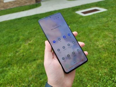
One UI 3 comes with a brand-new UI to match the same one-handed UX that Samsung has been working on for the past few years. It’s modern, it’s sleek, it looks like Color OS when it was bad. There are a few improvements and a few changes that come to match Android 11 and the one-handed UX, so let’s go over those in comparison to One UI 2.5.
Quick settings and notifications
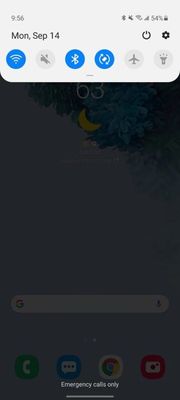
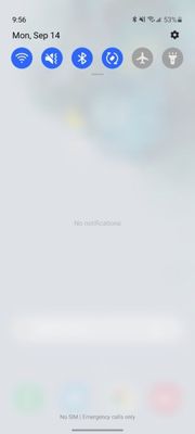
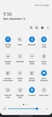
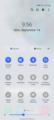
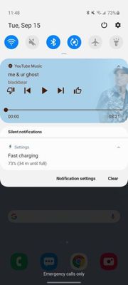
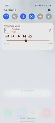
First things first, quick settings and notifications. These are the biggest changes to the overall UI I’ve noticed since installing the beta. These elements look completely different. Samsung removed of the card style UI elements and replaced them with a large shaded transparent background with blur.
One UI 2.5
One UI 3.0
One UI 2.5
One UI 3.0
Android 11 conversations
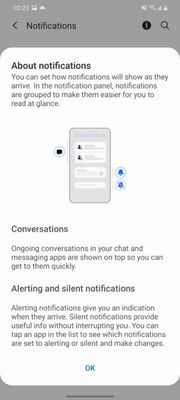
For notifications, Samsung is now using the new notification categories for conversations, alerting, and silent notifications. This works the same way across most Android phones with Android 11.
Media player
What Samsung did change is the media player. There are no media settings in the fully expanded quick settings panel, but instead only shows up in the notification panel. This isn't a change from One UI 2.5, but instead something Samsung didn't add from Android 11, where it would be in both locations normally. This panel in One UI 3.0 allows for you to swipe between media players and control it like the notification used to, but it is now in its own dedicated area.
One UI 2.5
One UI 3.0
Brief vs detailed notifications, notification history
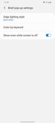
Samsung now allows notifications to appear in two different styles, brief or detailed. Detailed are the classic notification card pop-ups seen across every Android phone. Brief notifications are what Samsung has used to replace edge lighting, and are the new default setting. These features are the same, but with different names. Edge lighting is now deprecated One UI 3.0, thanks to brief notifications. It lights up the outside of the screen and shows a brief notification with minimal info at the top center.
One UI 3.0
One UI 3.0
One UI 3.0
One UI 3.0
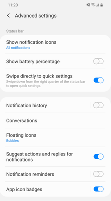
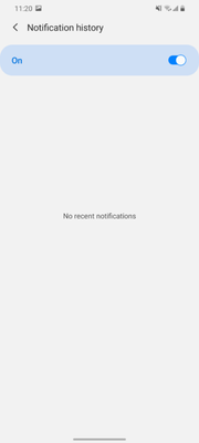
As part of Android 11, Samsung added notification history. It’s not enabled by default, so if you want it, make sure to enable it in status bar settings.
Notification bubbles
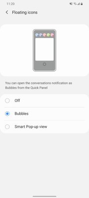
Android 11's notifications bubbles are supported too. These are like the old Facebook Chat heads, but system-wide. These are part of Android 11. Samsung does have a few options, bubbles and smart popup view. Smart popup view appears to be a custom Samsung version of this feature. Unfortunately, this option wasn't working for me in the beta and only bubbles worked.
Volume controls
One UI 2.5
One UI 2.5
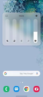
One UI 3.0
One UI 3.0
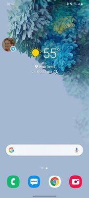
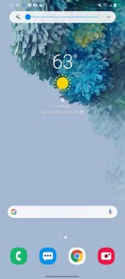
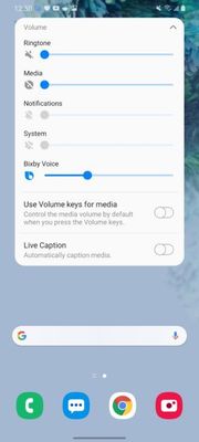
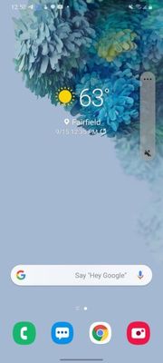
Samsung also redesigned and relocated the volume control UI. It’s now on the side of the phone, next to where the volume rocker would be. It’s much easier to access now than on the top of the phone where it previously was.
Homescreen
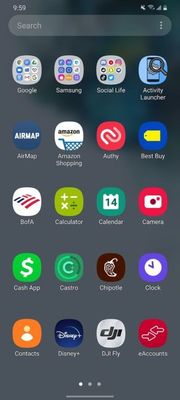
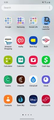
App drawer
One UI 2.5
One UI 3.0
With One UI 3, the home screen also gets a pretty big visual overhaul. The app drawer now matches the overall aesthetic of One UI 3.0. Samsung also added a double-tap to lock on the home screen. If you double-tap anywhere that doesn’t have a widget or an icon, it will lock the phone. Unfortunately, that feature is non-functional in the current beta.
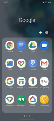
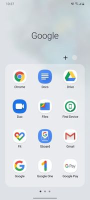
Folders
One UI 2.5
One UI 3
One unfortunate change Samsung made is to folders. Folders now only show 12 apps per page instead of the previous 16. It looks a Samsung decided to design the UI for taller phones rather than wider ones.
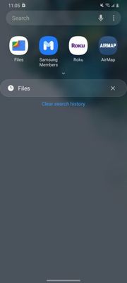
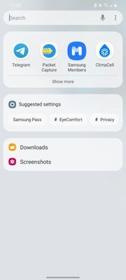
Finder
One UI 2.5
One UI 3.0
The Finder option in the app drawer also received an update with brand new suggestions. It will suggest apps, search suggestions, and settings. Previously, it would only show the recommended apps and recent searches.
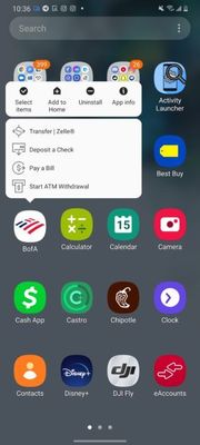
Long press menu
One UI 2.5
One UI 3.0
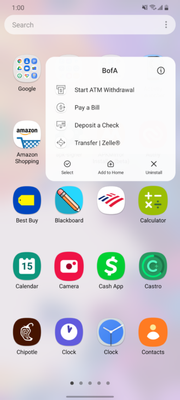
The long-press menu for the home screen has also been changed. It now says the app name along with just styled to be more similar to the rest of One UI 3.0.
Recent apps
One UI 2.5
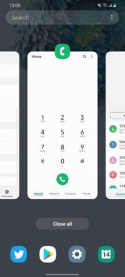
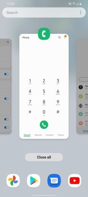
The recent app menu, which is actually at a system-level part of the launcher, did get changed as well. It is now a little lighter to match the overall aesthetic of the UI.
One smaller change is swiping down for notifications. Previously it was an option you would have to manually switch in settings, but now it’s enabled by default. A small but meaningful change to the overall UX.
Lockscreen and Always on Display
One UI 2.5
One UI 3.0
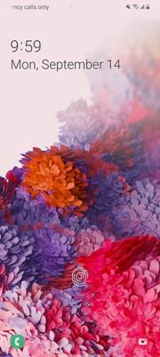
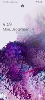
One of the latest changes is with the fingerprint icon for the in-display fingerprint scanner. It’s a bit different now, but so are the animations. The fingerprint scanner also feels much faster on the Galaxy S20+ on One UI 3.0 compared to One UI 2.5.
To add to the changes, Samsung moved the clock and notifications down towards the center of the screen. There’s also a new lock icon right under the hole-punch camera. The quick app icons at the bottom left and right corners are now also grayscale icons with high transparency instead of full-color icons in One UI 2.5. - CONTINUE ...
- Mark as New
- Subscribe
- Subscribe to RSS Feed
- Permalink
- Report Inappropriate Content
09-21-2020 10:50 PM in
Others- Mark as New
- Subscribe
- Subscribe to RSS Feed
- Permalink
- Report Inappropriate Content
10-08-2020 08:14 PM in
Others